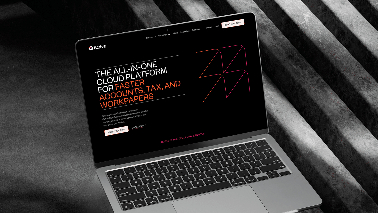
Following a major rebrand in preparation for global expansion, this SaaS company needed a complete redesign of their existing marketing site. The previous site lacked clarity, underperformed in conversions, and didn’t reflect the energy or direction of the new brand. Beyond aesthetics, the challenge was to audit and repurpose large amounts of existing content in a way that made sense for both users and the business.
Solution
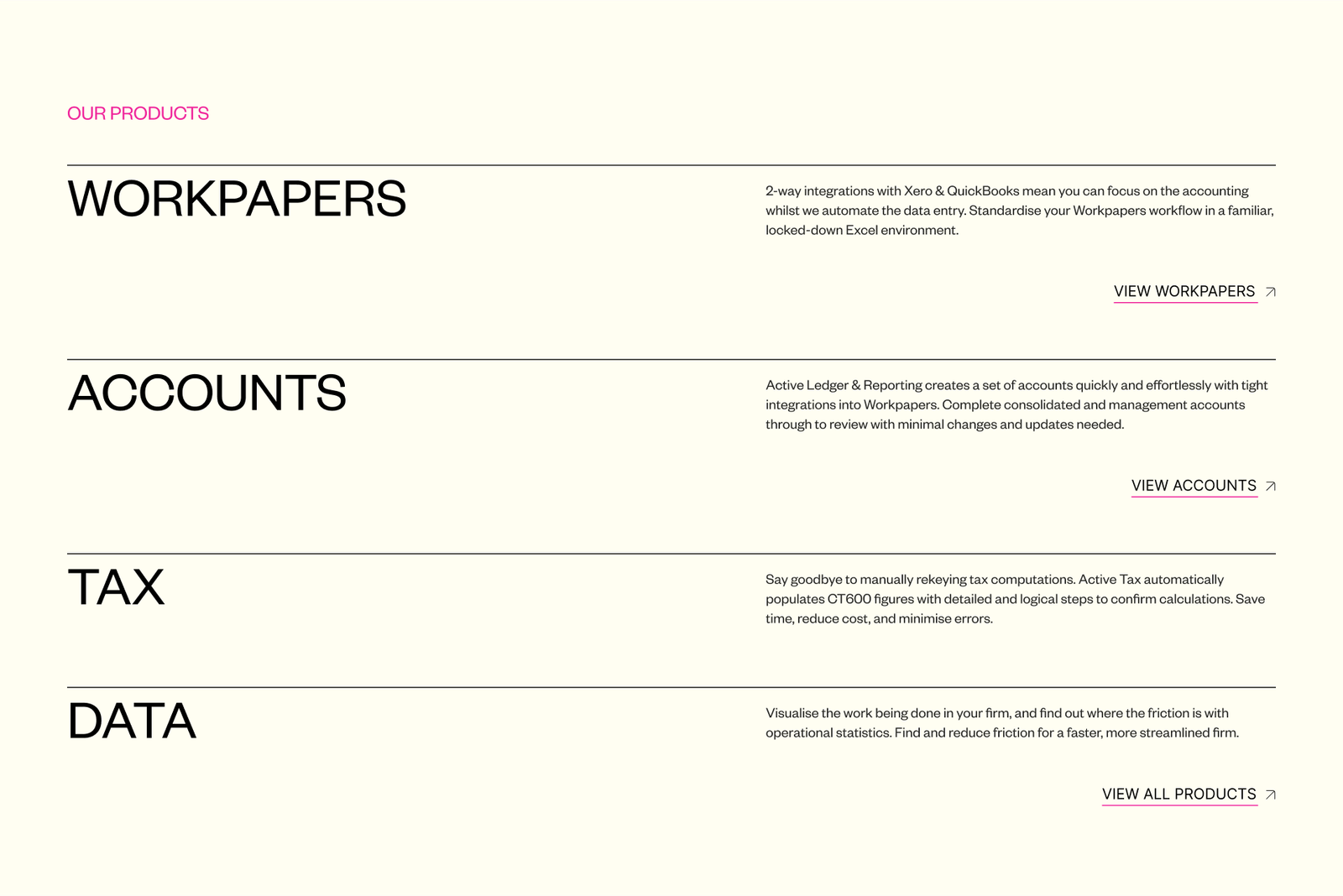
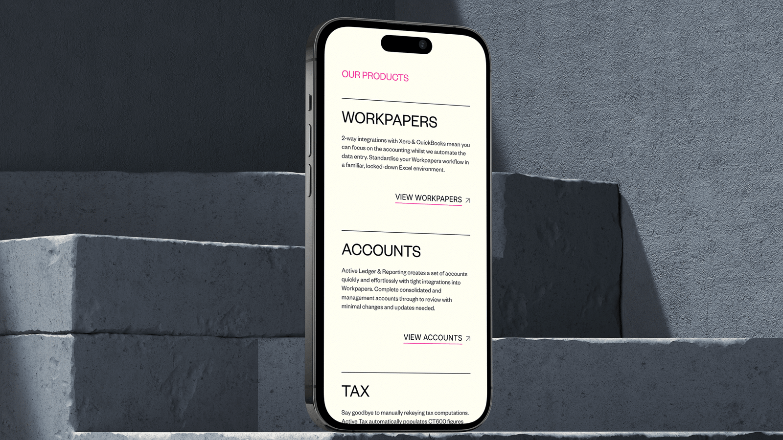
I led the project end to end — from UX and visual design through to Webflow development, CMS setup, QA, and CRM integration. The new site was built with a component-based architecture and a flexible CMS, making it easy to manage and scalable across regions. The goal was not just to make it look better, but to support clearer user journeys, product storytelling, and faster conversion.
Process
Using Figma and Webflow, I designed the full experience with sign-off in a single feedback round. Once approved, I handled the full development process with no revisions needed post-launch — a direct result of tight communication and a clearly structured build. The modular setup allowed me to build and QA the 28-page site efficiently, despite its complexity.
Outcome
The new site is faster, more engaging, and built for global scale. Conversion rates improved, CMS structures allow internal teams to own content, and the success of the UK site led directly to a follow-up commission for a US version. With three CMS collections, deep integration support, and a solid visual system in place, the site now supports sales, demos, and product education with confidence.